Overview
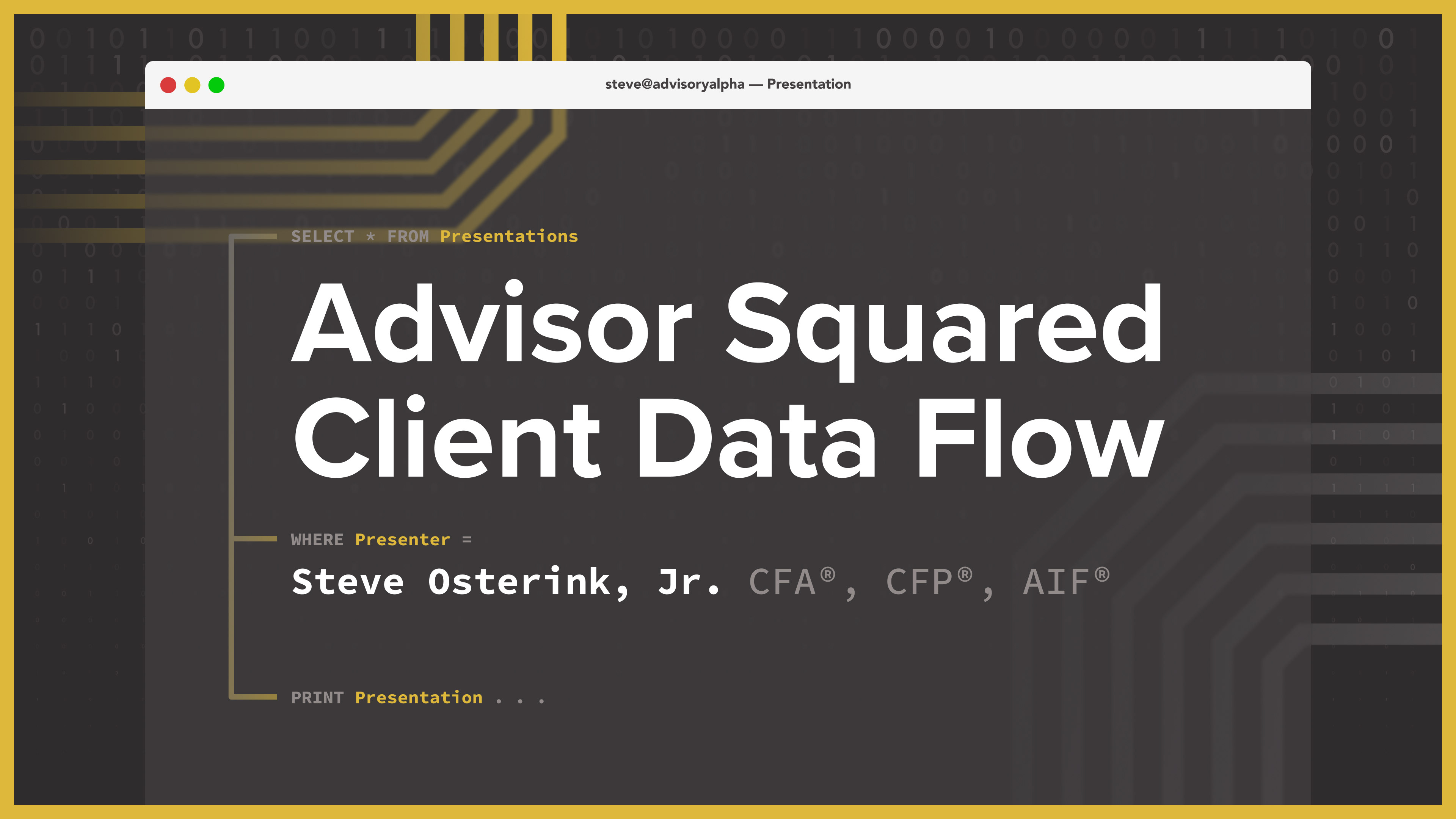
As part of our strategic event marketing, I led the design of a high-tech presentation to showcase how our proprietary Advisor Squared platform handles data behind the scenes. The goal was to give prospective advisors a clear, confident understanding of how client information flows securely and efficiently through our system.
The Problem
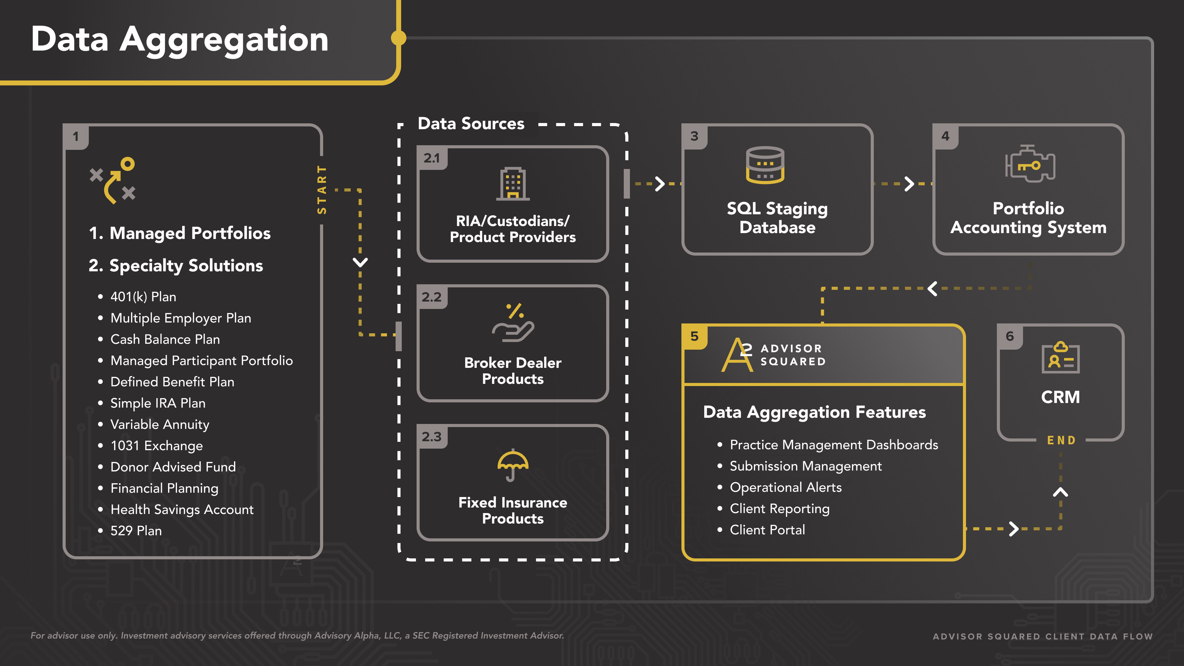
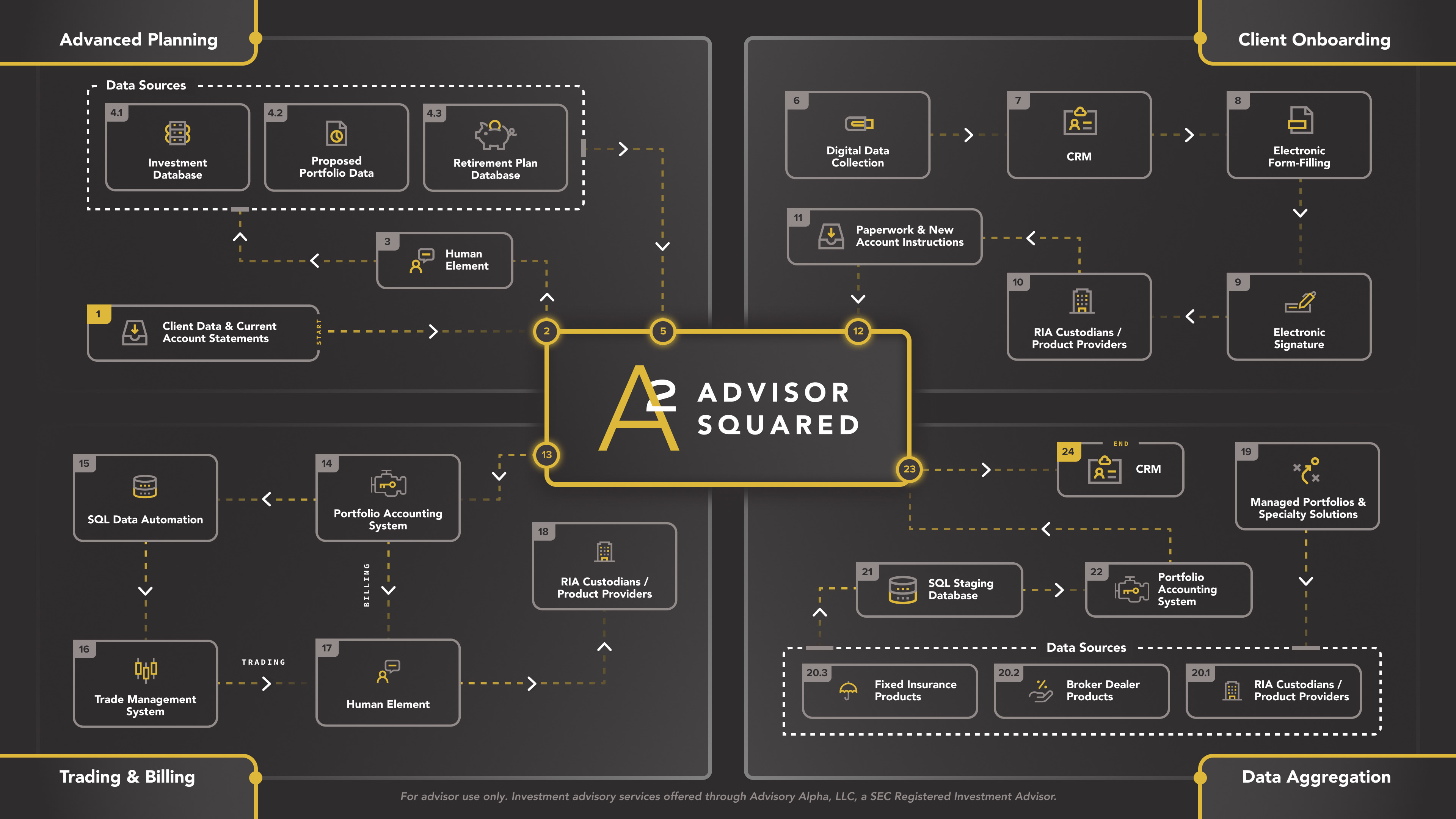
Explaining operational workflows—especially in the back-office world of trading, billing, planning, and onboarding—can quickly become overwhelming or abstract. We needed to visually simplify our complex infrastructure to help advisors see the value of our integrated system.
The Solution
I created a tech-forward, SQL-inspired presentation system that walks prospective advisors through each core component of Advisor Squared:
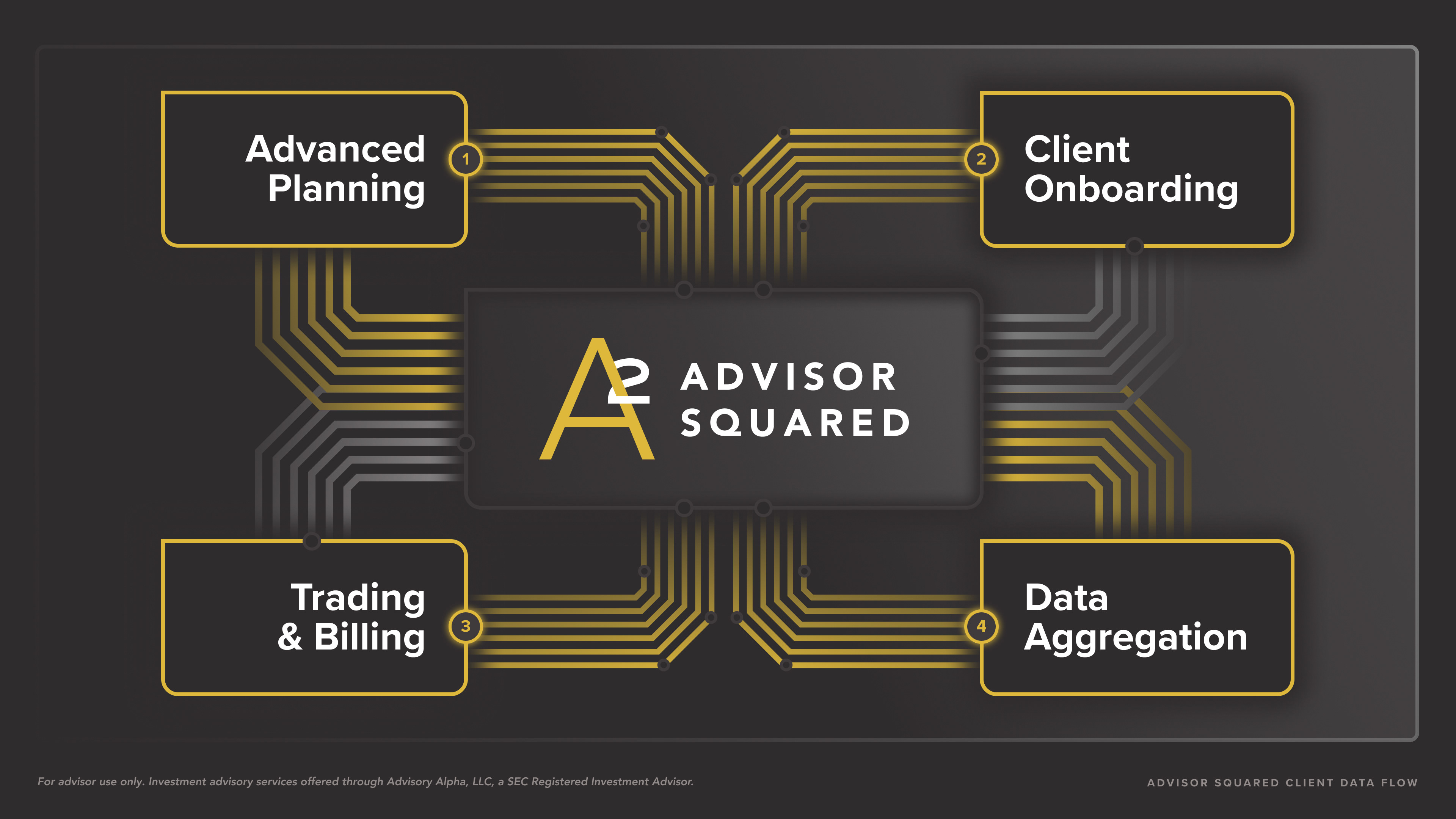
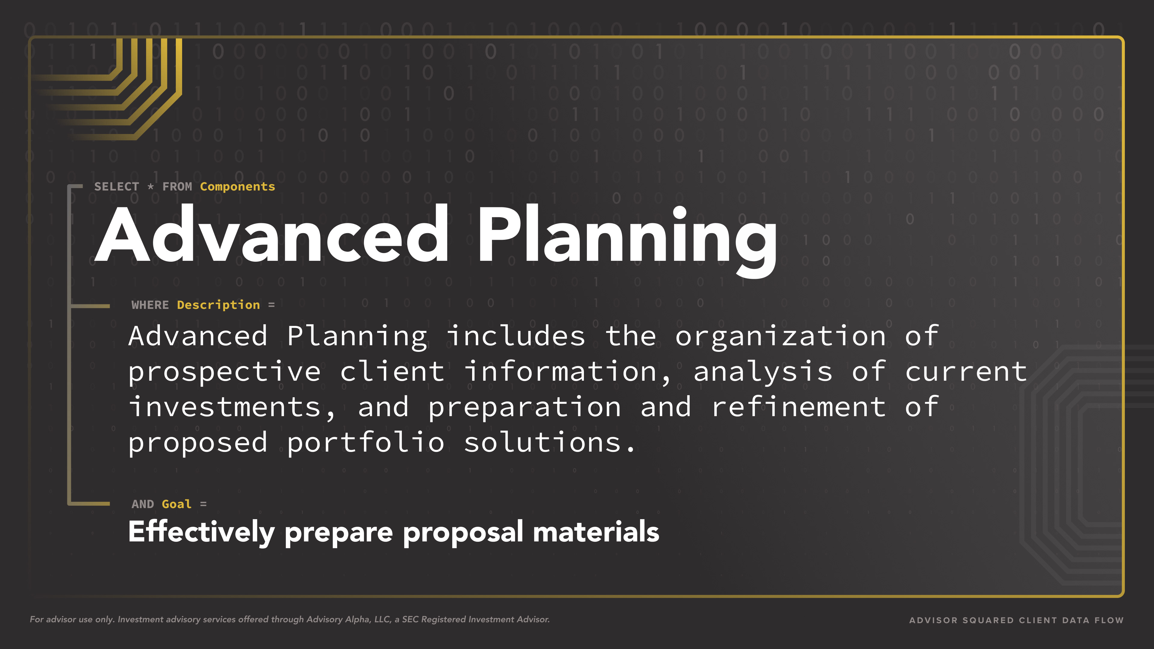
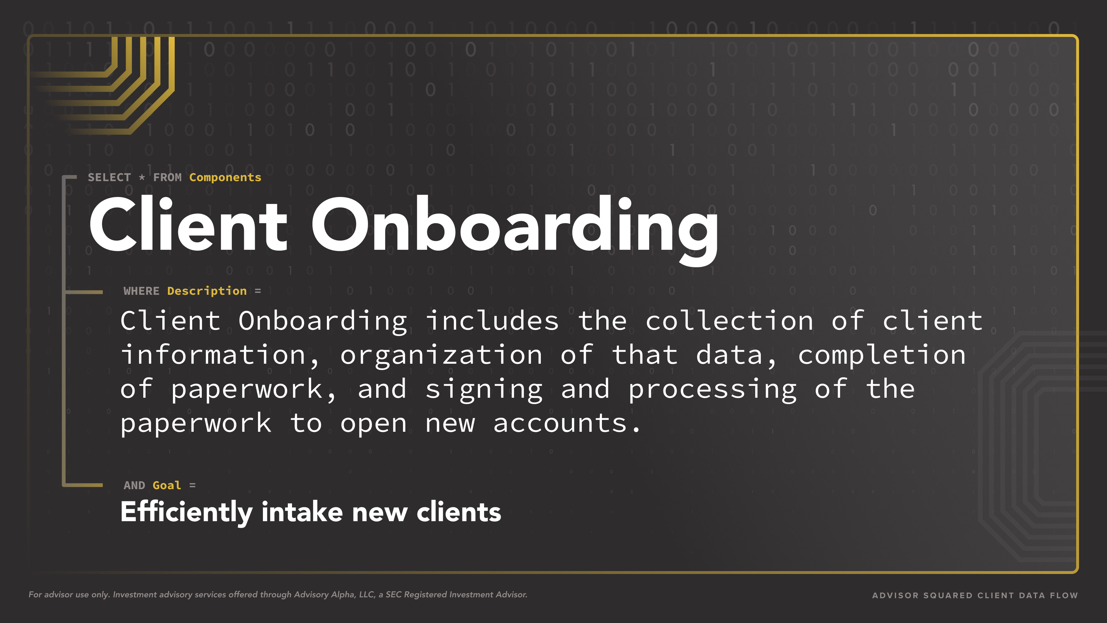
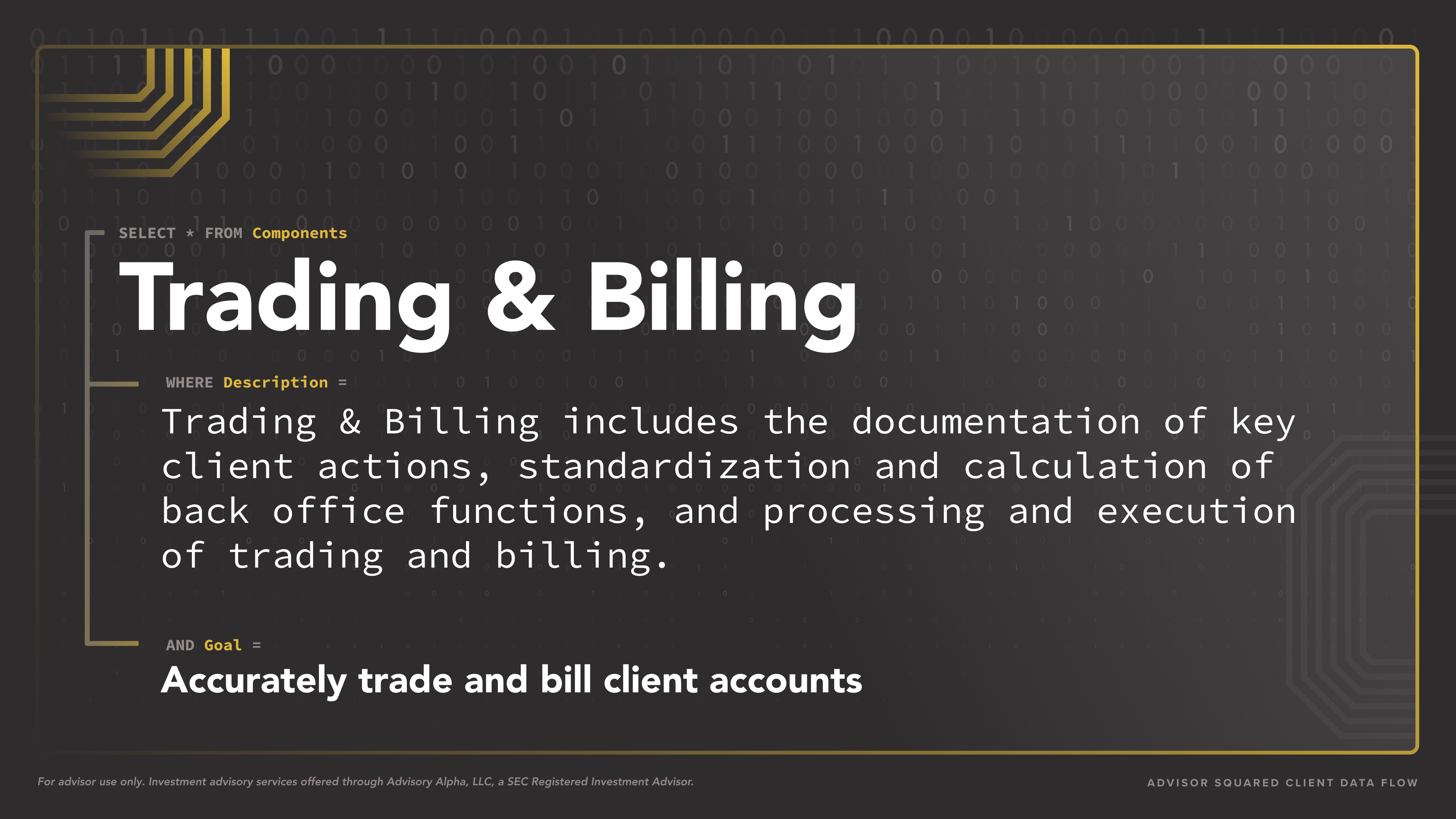
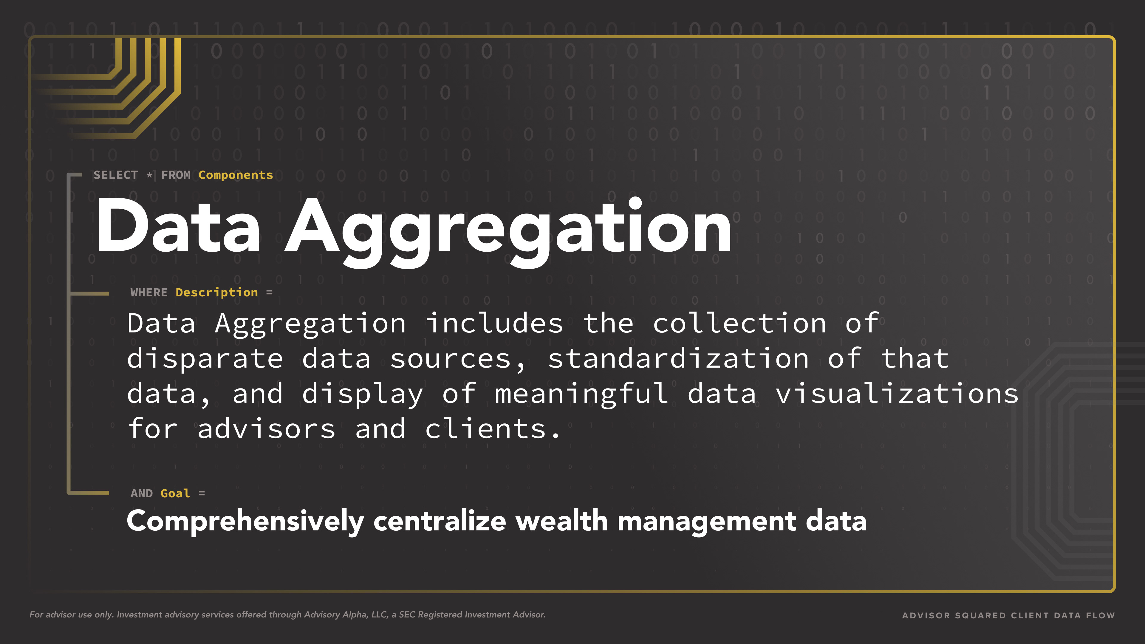
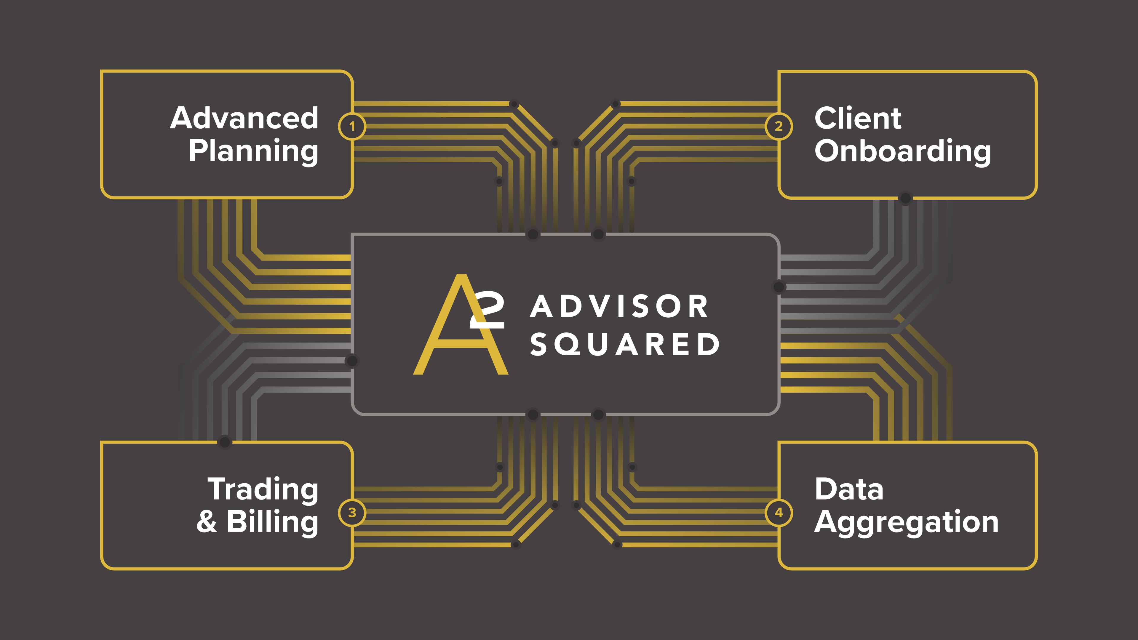
Modular Component Slides: Each major function—Advanced Planning, Client Onboarding, Trading & Billing, and Data Aggregation—was introduced with bold titles, structured logic (e.g., WHERE, SELECT), and simplified goals.
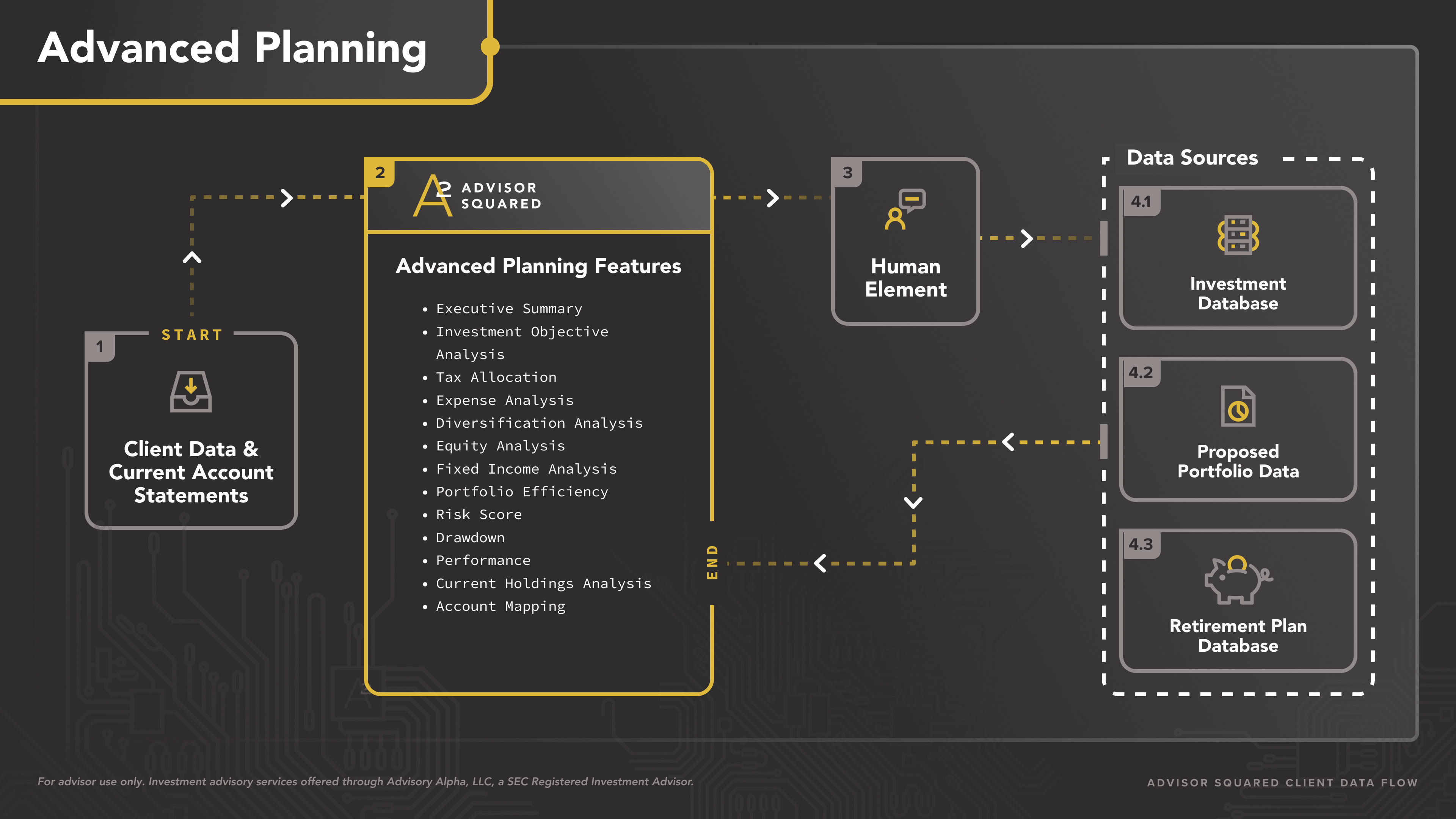
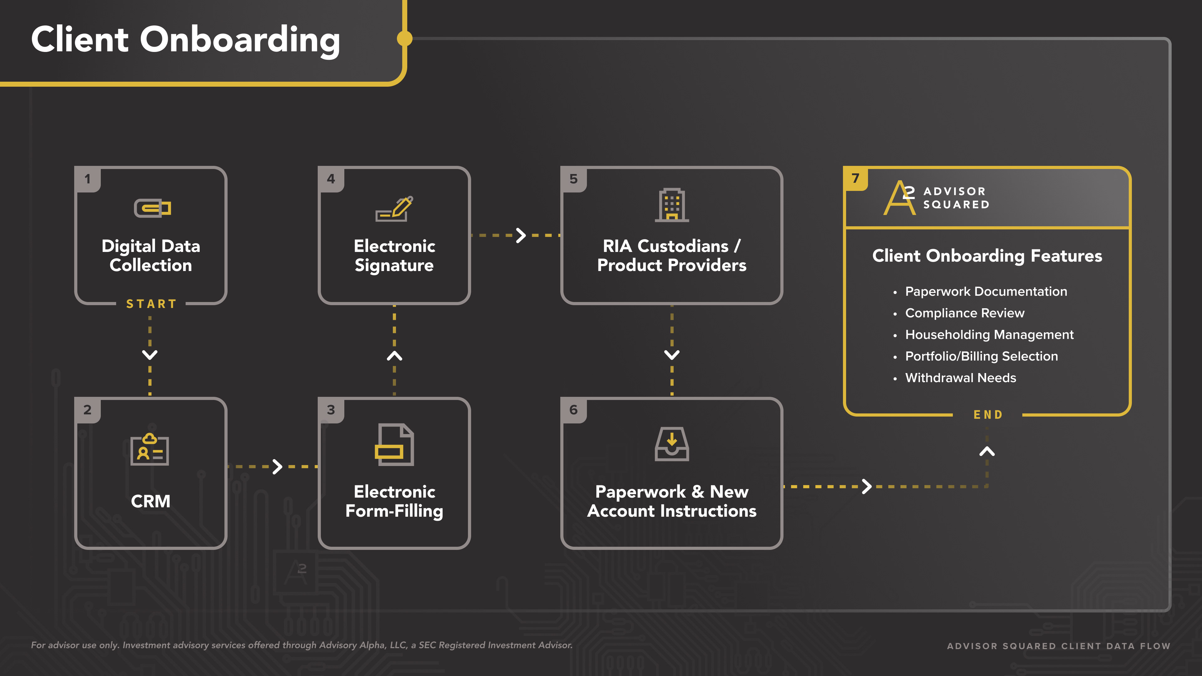
Process Diagrams: I designed detailed flowcharts to show how data moves between CRMs, SQL databases, custodians, and other tools—reinforcing the platform’s efficiency and integration.
Central System Map: The final slide visualized Advisor Squared as the data hub, bringing together all touchpoints into one cohesive ecosystem.
These visuals were used in advisor recruiting presentations, conference booths, and sales conversations to demonstrate our platform’s sophistication and transparency.
Tools Used
Figma, Adobe Illustrator, PowerPoint