Overview
Redesigned two cornerstone deliverables — the monthly Market Review and companion Data Summary — to enhance storytelling, usability, and advisor customization while aligning with broader brand strategy.
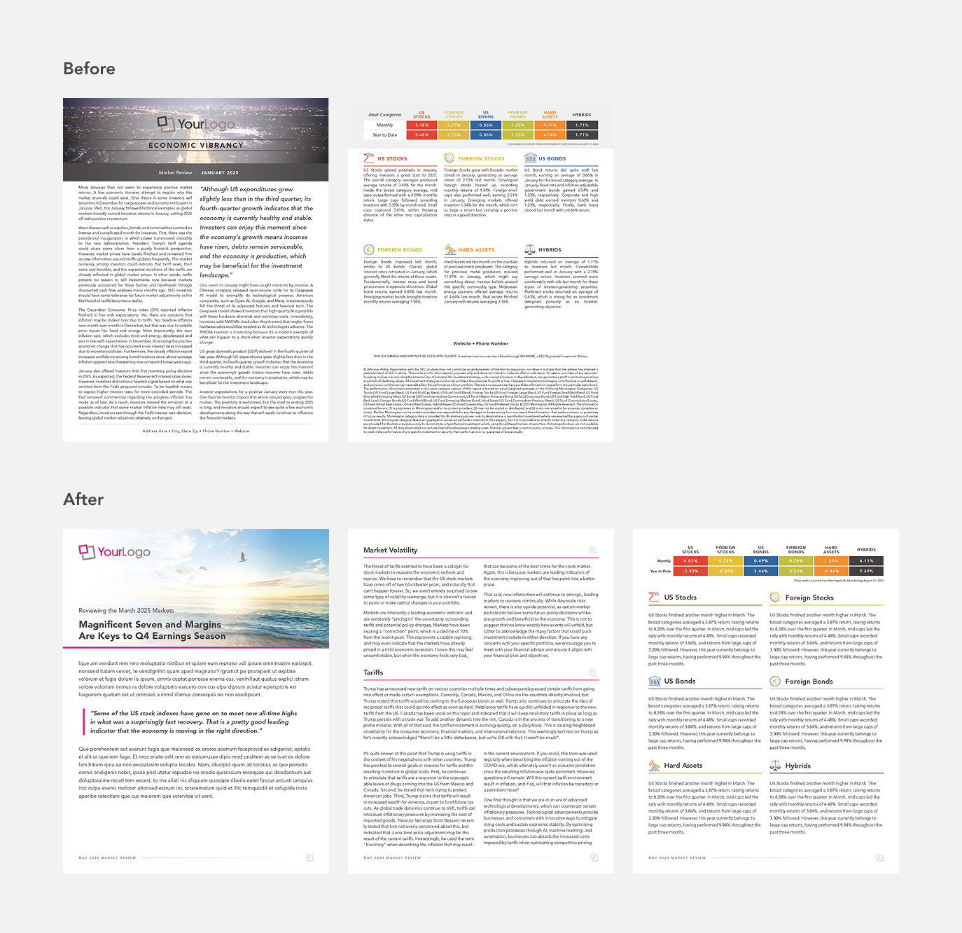
The Problem
The old layouts lacked visual hierarchy, used outdated typography, and were difficult to adapt to different advisor brands. Advisors needed a way to present market insights with more polish, confidence, and visual clarity.
The Solution
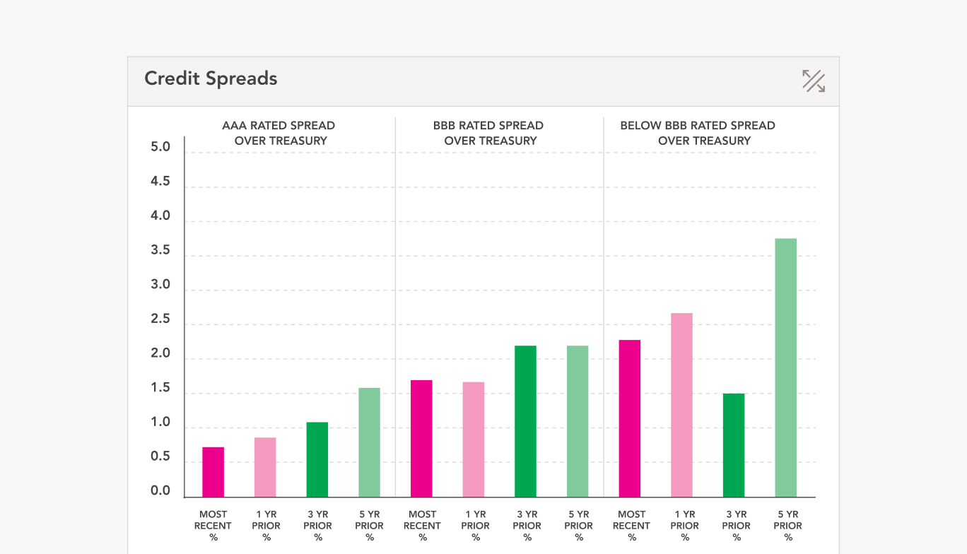
I created a modular design system for both resources. The Market Review now features clean headlines, pull-quotes, and reader-friendly spacing for improved narrative flow. The Data Summary uses updated data visualization techniques, performance matrices, and risk-return snapshots to help advisors walk clients through insights visually. Each piece is built with style overrides and layout zones to accommodate advisor logos and brand palettes.
Tools Used
InDesign, Illustrator, Excel